05.05.17
Product Design At Its Finest
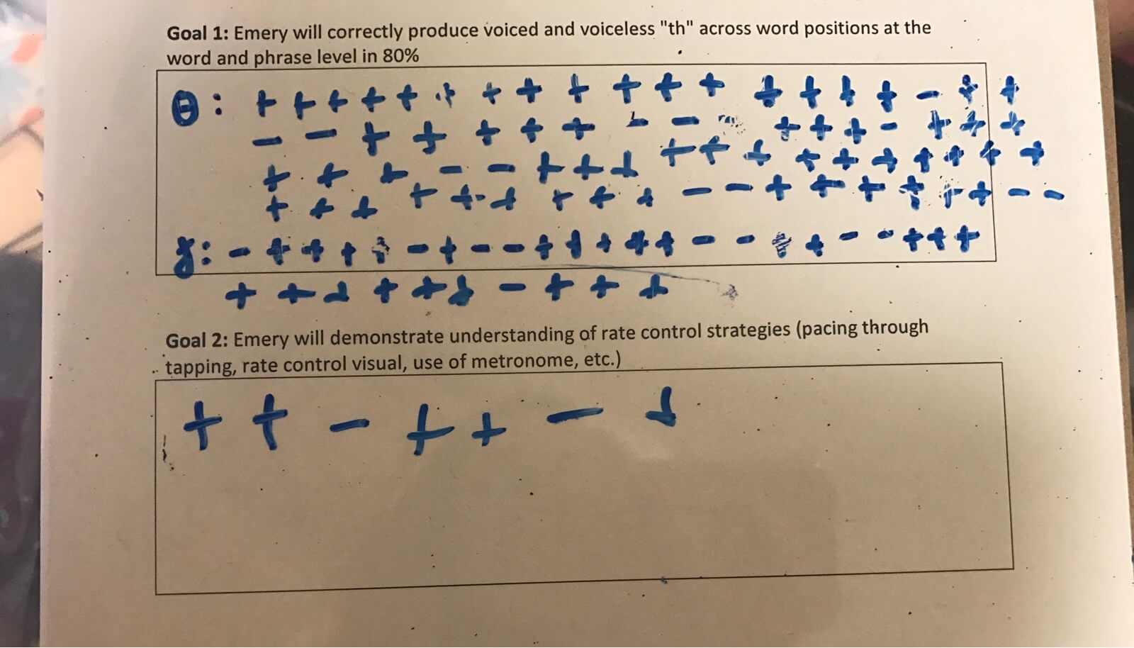
My wife has completed more usability tests than you could imagine and hasn’t been paid a dime for the help. So when she asked me to design a new way for her to track her patients’ speech therapy sessions, I figured I probably owe her a good solution. She wanted a way to mark success or failure for each task that she gave a patient. Of course, my mind went directly to a digital solution; a way that she could use a tablet or phone to track with the tap of a button.
Then we got to talking; a user interview if you will. I learned that the tasks are rapid; usually each question she asks a patient has a word or short phrase as a response, meaning she is tracking success, controlling a child, carrying on a conversation, and thinking about the next question every moment. I also learned that each of her 36 patients each week has different goals, meaning each has different tasks to test. And finally, I learned of the business constraint, no personal devices.
Then I asked, “Well what is your goal for this new thing you want to create?”
And she said, “I just want to stop wasting paper and wasting time. The paper pencil method works well for me, but I have to use a clipboard that is kind of bulky and I have to print a new paper for every patient every time they come. So that takes my time, finding the right file, going to the printer, and keeping my desk in order.”
I first thought about laminating each patients’ goals, but that doesn’t lend to the quick turnaround time and new patient that she might pick up in the middle of the day. And there would be large overhead cost of time to get all the sheets laminated.
Then it hit me! I remembered back to elementary school when teachers would let the class use dry erase sleeves to practice handwriting. I loved them. She would only have to print one copy of each patient’s goals, keep them in a file, and then slip them in the sleeve when the patient came in. She’d need a few of the sleeves to use until she had a break to enter the data, but then she could erase and reuse. Plus, the weight of the sleeves would mean no more bulky clipboard.
I bought the materials and got the test up and running. The solution worked great for her with one exception. We found that the dry-erase markers were too easy to accidentally erase when dealing with young children. So we went to wet-erase markers.
When her boss noticed her new technique, she asked her to show off her solution at a team meeting. What seems like such a simple solution is getting rave reviews from her teammates. This just goes to show how talking with users and asking the right questions can lead to a product that solves a problem with little cost and no app!
04.03.17
Creating a Design-Led Culture in an Enterprise
The question is asked all the time. "How do I create a design-led culture in an enterprise?" And the answer is really simple. From the top down.
But what fun is that? People come up with all kinds of ways to prove the value of discovery and quantify usability improvements for the enterprise. All that is great and true, but without a shift at the top, those example are just great case studies that designers can use to find a better environment to work in that has a leader that puts design first. It’s what I did.
The enterprise I came from
- Executives constantly questioned the design’s usability tactics.
- Designs had to go through extensive review processes from visual design reviews, to stakeholder reviews, to executive reviews. Along the way, the designs that were informed by user feedback we peeled back into designs that were what high-ups wanted.
- Three-fourths of the week was spent pushing pixels to make the visual design perfect and building decks to report up to executive powers.
- Talking to real customers was nearly impossible. Our only outlet was scheduling interviews through a third party recruiting service that cost thousands and had a multi-week turnaround time.
- The development team and design team constantly clashed when there were any new learnings that influenced the need to a change.
- Timelines for production deployments were our ‘north star’, if we don’t hit our dates through each process of the lifecycle, a user story wasn’t getting into a release, until executives said it had to.
The enterprise I work at now:
- Executives trust the process and the skills of each product team.
- Executives state the problems and product teams solve them.
- The product teams solve problems together, from discovery through delivery so there is no clashing.
- Executives invest in discovery, making it very simple to find research participants.
- At least 6 customer interactions must be had for each product team every 2-week sprint.
- Executives use Open House to get their updates from product teams. Every other Tuesday afternoon the product teams showcase what they learned the past sprint, what they delivered, and what they plan on tacking next sprint, as well as reporting KPI statuses.
- The environment is much less stressful and more enjoyable to be a part of
What was the difference? Not the quality of designers or the team structures; but the philosophy of the leadership team and the trust they had in their product teams. They were 100% bought into the Lean UX principles.
How did that happen at one place and not the other? One day, a very well-known thought-leader, Marty Cagan, told one of the executives that the success of the business was not sustainable. If the business didn’t start thinking of itself as a software company, the new competition would swallow them up. That caught this particular executive’s attention and sparked conversation and eventually workshops on how to create a thriving software environment.
Turns out those well-known thought leaders have a lot more persuasion strength than in-house designers, or engineers.
10.16.16
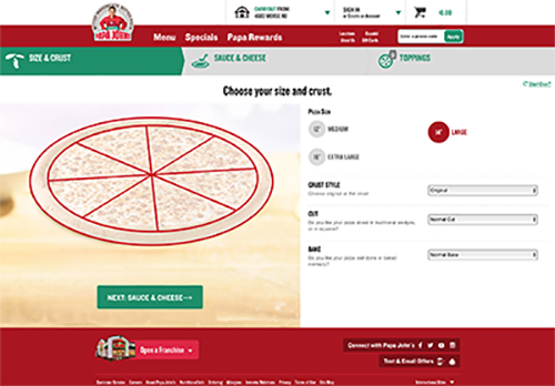
Analyzing Papa's Test
Continuing with the Papa John’s theme from my last post, this week I reviewed some usability sessions conducted by my classmates using papajohns.com. It is crazy to me how analyzing four 20 minute usability sessions conducted by students can still glean so much insight on ways that a popular website that I am sure went through extensive research can be improved. Not just little tweaks either. I’m talking changes that would have a huge impact on usability if executed correctly. It goes to show a product is never perfect. Usability testing should be an ongoing effort because something new will be discovered each time.
The analysis pointed to one particularly concerning trend. There are problems with the custom pizza builder. I noticed multiple people having issues selecting toppings and changing a topping from the full pizza to half. To me, choosing toppings is the crux of the online pizza ordering process. The confusion could lead a customer to make a phone call to order the pizza, which is time wasted for store employees, or even worse, losing the order as the customer chooses another site that is easier to do what they need to do.

09.30.16
Testing Papa
This week I conducted a usability study for papajohns.com. The participant was asked to order 3 specific pizzas, then sign up for email promo messages, and finally contact the corporate office to file a complaint.
Overall, the session went very well. I was a little surprised that this particular participant has never order pizza online, being a millennial that does eat pizza. According to her, it’s just easier to call. However, she didn’t seem to be behind the curve at all while completing the tasks. I was also surprised by the behavior of the Papa John’s website when she initially chose to place an order for carry out. The next thing the site prompted her to do was enter her delivery address. She started to enter it, but then realized what she was doing and recovered quickly by skipping the step and choosing the pick up location.
There were two things that stood out as areas of improvement for me. I’d like to open the session by creating more of a rapport with the participant upfront. Instead of reading, I’d like to get comfortable enough with the script that I can have a conversation with the participant without forgetting all the things that I need to tell her. But this has to be consistent so one participant doesn’t have any advantage over another. The second was task specific. When the participant ordered her first pizza, she tried to order the pepperoni pizza, and then add mushrooms, but completely missed the option to customize it. I should have explored that more afterwards by asking questions to see if she missed the customize option or if she just didn’t expect it to allow her to add toppings.
That said, I still think my performance as the moderator was just as good as I expected. I think I did a good job of asking the right questions to understand her feelings about the feedback form she ended up on to provide feedback about the bad pizza. I was able to remain unbiased, I encouraged the participant to think out loud at the right times, and she did a very good job of that. And I let her figure things out on her own without interruption. All in all, a successful usability test that would be useful for Papa John to see!
09.24.16
Quantitative or qualitative
The simplest way to differentiate qualitative and quantitative data is that quantitative data is numerical based and qualitative is not. Both can be very important measures, but the level of importance depends on the audience.
I have found qualitative measures to be more informative to the design team throughout the design process (though quantitative measures have come in handy also). Qualitative measures do a much better job at explaining why, which gives the team a better idea of what needs to be tweaked to fix the problem. But as designers we must be careful to be as objective as possible. When we start introducing subjectivity, our results can become skewed.
However, the further up the corporate ladder you go, the less accepting stakeholders are of what they call ‘fluff’, and the more they need true numbers that they can digest. What percentage of users clicked the wrong button? How many clicks does it take to finish a transaction? While these numbers are great, they can be misleading or conflicting, which is something only the design team might realize. For example, a few extra clicks could make for a simpler, and therefore quicker, transaction. So be ready to rationalize!
09.19.16
What I've learned about tasks
In my past work experiences with creating tasks and scenarios, I have found two keys to success over time.
The first is to keep them simple. For one of the first usability tests I designed, I used a very complex scenario in order to put the participant in a situation that I had observed many people in in real life while using an ATM. Looking back, I should have known that I needed to simplify the scenario when I was writing a cheat sheet so the participant could remember what he was asked to do. This involved scenario caused far too much brainpower to be used on remembering the task, so the user-ATM interaction seemed almost mindless. Needless to say, I re-wrote the scenario and started from scratch on day 2. Luckily these were ‘free’ usability tests!
The second key to success is to test the scripted scenario early and often, just like everything else we do. To the expert of a system, the words we use may not make sense to someone coming in off the street. Learn that before starting a study by asking someone that works outside of your group, or your dad or wife at home, to explain what the scenario is asking him or her to do. I remember one test I facilitated where the majority of people had to ask a question to clarify what their task was. At that point, I had made them feel inept taken them out of the element I had worked so hard to set up.
09.11.16
What kind of testing?
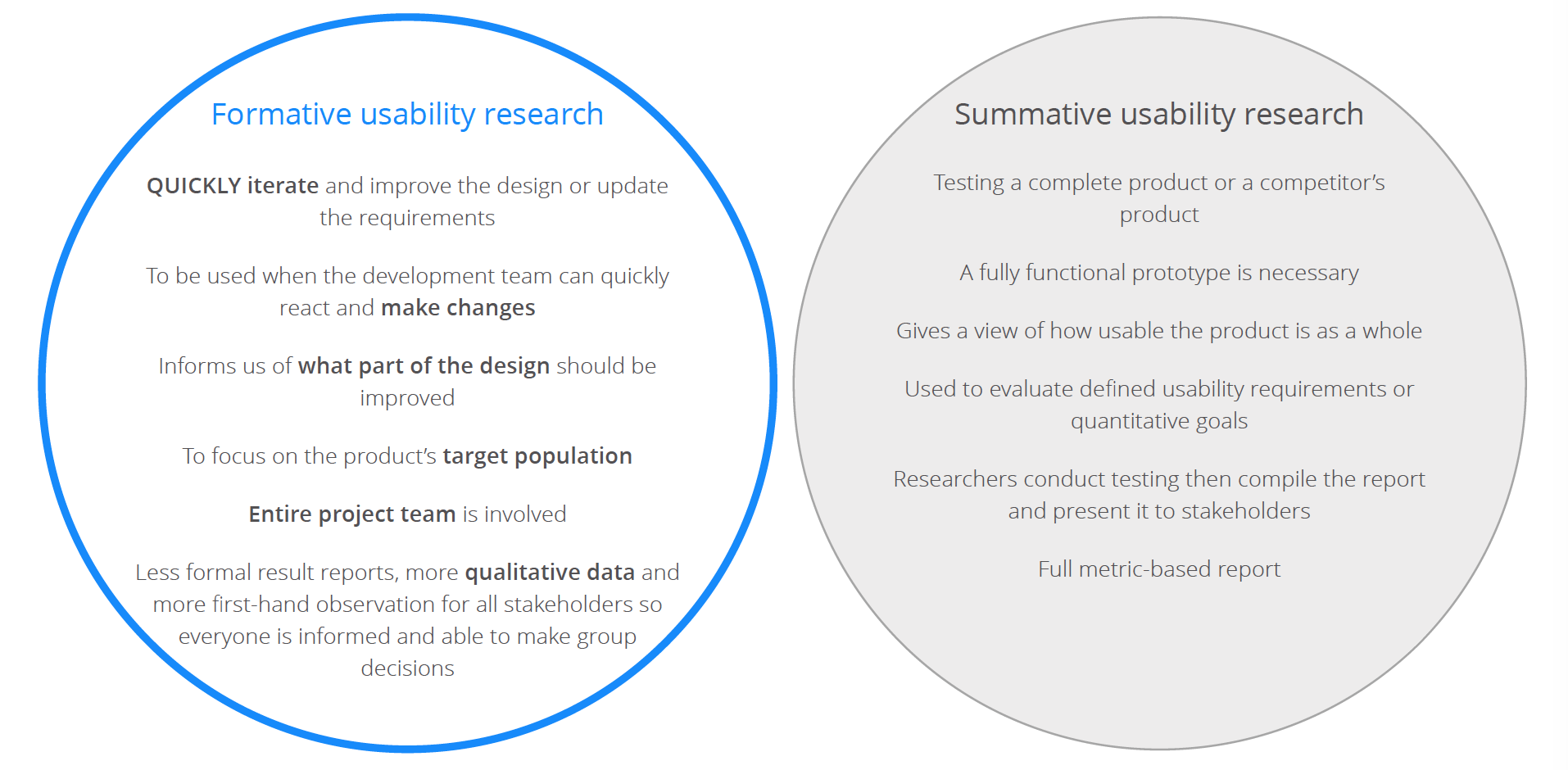
One key aspect of my role as a UX designer is to identify where, when, and what kind of testing is necessary. Where and when is easy; as early and often as possible. Deciding what kind of testing has so many variables: timeline, budget, prototype resources, goal of the testing, audience, etc. It is up to the designer or researcher to evaluate those variables for a given project to decide if formative or summative testing is the best option.
In my experience, I lean more towards formative testing in most cases because I am usually using the testing to inform myself and the design team in order to make design decisions. Being able to evaluate and react in an iterative process has proven successful. The team comes to a design that fits our defined visual language, creates a quick prototype and script, tests 5-10 participants, then goes back to the drawing board to tweak the things that proved problematic.
While most of the testing is formative, summative testing is critical when it comes to selling a final design to senior management. Having baseline statistics and being able to show data to prove that a new design is better than the old goes further than qualitative statistics with that particular audience. Having baseline numbers available is advantageous for the team because we are able ensure that we are always improving the product, never making it worse.
09.05.16
How many tests?
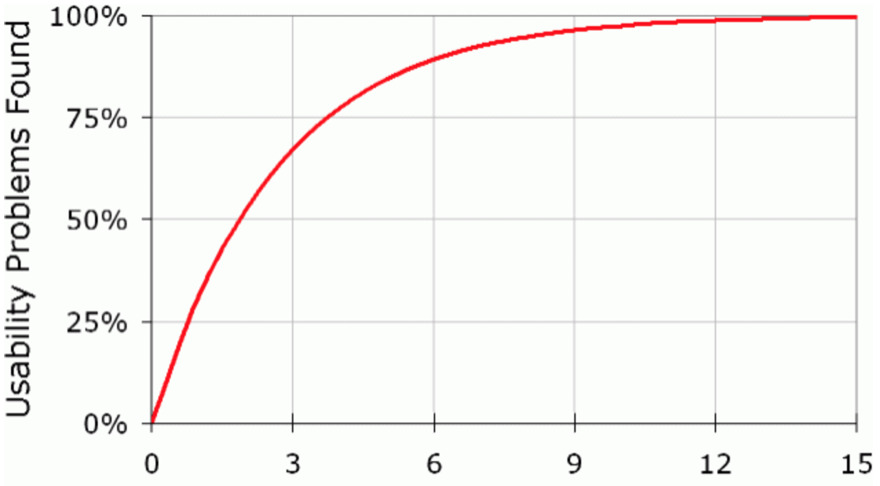
Experts in the field of usability testing have long had to defend the argument that usability testing is not to statistically prove that a usability issue found is the reason for low conversion rates or high page exits. Jakob Nielsen writes that 5 participants is the sweet spot. You'll uncover 80% of the usability problems that exist and none of the most important ones will slip through the cracks. (Nielsen, 2000)
In addition to the expert analysis, I have experienced the phenomena in usability testing first-hand. In a past role at Chase I was tasked with finding the usability issues that were causing incomplete ATM transactions and a rising number of customer complaints. I set up a full week usability test plan that would test 24 participants. After day one (5 participants), not a single usability issue that was worth fixing in the immediate future was uncovered.
More importantly, the last four days of testing were days that could have been used to design solutions to the problems that were uncovered and then handed off to the development team to code. Instead we had to wait until the next sprint for development to start coding. And the dollars that were spent on reimbursing the participants could have been used for follow-up testing to make sure that the design solutions we eventually came up with solved the underlying problems.
So don't get stuck on the numbers; use usability tests as quick insight into the issues that exist, then spend the extra time designing great solutions!
08.21.16
Dealing with NDA
Non-disclosure agreements (NDA) can be a nuisance to any designer that is looking for a new opportunity, especially those of us that are young and have only had a few projects to add to a portfolio so far in our career.
However, I saw a great piece from Andrew Doherty about his NDA at Google. On his site he says, “For the last year and a bit, I've been working at Google in Mountain View California, leading design on a new product. Unfortunately I can't share any details, mocks, or screenshots with you yet. But when it launches, I'm pretty sure it will change all of our lives.”
While the tone of the copy may sound a bit arrogant, the idea of using the NDA to make his project sound like the coolest thing in the universe without any signs of the work is genius.

08.14.16
All documents demand perfection
As a UX designer working in what is the definition of corporate America, I have an uphill battle to climb. But it is climbable. And one key to the ascent to the top of a user-centered design mountain is selling my skills. It would be nice to have executives listen in on user interviews or usability tests and understand what goes into generating a persona, but they don’t have time for that.
What they do have time for is 15 minutes here, and a half hour there to pitch an idea or a new design. In those times, deliverables need to be perfect and pretty. Show off your creativity and attention to detail. Make your work stand apart from the corporate PowerPoint decks. Turn raw data into a picture that tells a story. And practice your elevator pitch. Make those executives feel like you are their own design agency.
It sounds petty, but the more those executive fall in love with what they are seeing, the more trust they gain in you, the more freedom you’ll have to do the things UX needs to do, and the more likely that executive will be to say yes when you say you need to add another designer to your team.
08.06.16
The little things go a long way
Usability testing is a fragile practice. Many things can go wrong to invalidate a test. In the heat of the moment, when you have a test participant in front of you expecting you to be on the ball, but also hoping that you’re going to ease their anxiousness, the last thing you want to be doing is fumbling around with a stack of papers. If you do lose your place, you get nervous and turn red, but even worse, you’re likely going to take the test participant out of the mindset that they are in the real environment that you took so long to set up.
That’s why creating a simple, well-planned moderator guide is hugely important. It’s one thing that is totally in your control, so don’t skimp on it. The moderator guide we use at work is a template that was created years ago. It’s far from perfect, but nobody has raised a concern about it because they either don’t want to create a new one, or because it’s “just the way it has always been.” Myself included. Until now, when I branched away from the guide template that I have always used at work, and created one from scratch, minimizing content down to the bare essentials, and using some visual design techniques to create hierarchy.
In the four tests I conducted this week, not once did I stumble around the documents, making the flow of the test feel so much better. It’s funny how little things can make all the difference.

07.31.16
Blurring the lines
In one of the presentations this week, I remember a quote about “the lines between LUMEN phases blurring when working in more iterative environments.” They absolutely do, but why do those lines need to exist in the first place? Do we need defined process and phases?
I listened to a keynote speech by Jared Spool a while back where he talked about UCD being a thing of the past. While I don’t totally buy that, I do think that sometimes we do things as part of our process just to say we did them and to check a box in our process checklist. Not all projects require a card sort and an end-to-end usability test. Spool made a great point saying that we shouldn’t have a process just for the sake of having a process. It restricts us and wastes time. Rather we should focus on constantly observing people using your product, creating a true vision for the product that everyone understands and buys into, and producing a great culture that brings out the best in the designers and team as a whole. Those are the things that a necessary in EVERY project.
07.24.16
Design for Grandma Dolly
My parents vowed they would never use their phones for anything besides making phone calls. Now are lost without their iPhone, using it as their main avenue for checking email, their bank statements, and yes, even staying connected via Facebook. I kind of expected it to happen. But then I received a text from my grandma, Dolly, about two years ago. That one was shocking. Dolly and her husband have never had a computer; they refused to use one. Yet, Dolly broke down and bought an iPhone and now she uses it to check the news and send text messages.
It’s interesting that as technologies evolve, it’s common to have to take a step back and think about who the next generation is the will be using your product. How does a standard wristwatch company stay relevant with the upcoming generation? And how does Time Warner Cable keep their grip on that generation?
But with design, there are no worries about it being replaced with something else. But we also know that the people entering the realm aren’t just youngsters. Right now is the time that we have folks in their 60s and 70s using websites and mobile apps for the first time. They are the newies that can determine the success of your design. That won’t last, but the market right now is huge. Like Dolly, millions of those in her generation are finally letting down their pride and breaking into the booming iPhone world and their needs and goals are totally different than anyone else. And if we as designer choose to ignore those, we’d be making a huge mistake.

07.16.16
Taking notes is great
During research studies at work, I have the benefit of a teammate to take notes all the time. As Goodwin mentions in her book, it’s great to have someone else in the room taking notes during a research interview because it allows the interviewer to focus on the conversation. Makes sense.
However, in this week’s assignment to conduct mock interviews around the ReminderX product, I didn’t have the luxury of an observer and note-taker, so I had to wear multiple hats at once. And it wasn’t so bad. It gave me a chance to process the participant’s answers and debate what follow-up questions were necessary or which direction I wanted to take the conversation in next while I was writing notes, alleviating the awkwardness of silence. In essence, me writing covered that normal awkwardness with a purpose in both my and the participant’s mind. And it also gave the participant time to think and expand on an answer without me saying anything on a few occasions.
In future interviews at work, when I do have a note-taker, I am going to try to take more of my own notes as I am thinking and processing. To me, it’s a great excuse to pace the interview so I’m not rushing into another topic while missing an opportunity to touch on important follow-up questions. Slow and steady wins the race!

07.10.16
What kind of designer am I?
I know my strength is in interaction design. My mind is able to see the full picture and think of the experience as a whole while focusing on a single element or interaction. I’m able to combine my basic knowledge of information systems with my empathy for users and understanding of basic psychology and human factors principles to visualize a logical workflow and screen designs.
I remember hearing about the two different types of interaction designers as defined by Cooper. But I never really thought about which one of those I am. Honestly, it seemed odd to me that there needed to be two distinct kinds of interaction designers. Don’t we already have enough different titles in the UX world?
But as I was reading Goodwin’s book this week, Cooper’s separation started to make sense. Cooper calls the two types of interaction designer “generators” (those who is drawing on the whiteboard, throwing solutions out based on instinct and acquired patterns and principles) and “synthesizers” (in my mind, those who like to think about the solutions overnight and challenge the instincts of the generator). While I am typically the one at the whiteboard at work, understanding the distinctions between the two makes me think that I am really a synthesizer. When I’m at the whiteboard, I am constantly second guessing myself as I am sketching. I am much more comfortable communicating the design that I have analyzed and become comfortable with over time than I am “designing on the fly”. But I also think it’s a good thing that I am challenging my nature and wearing both hats depending on the situation!
07.02.16
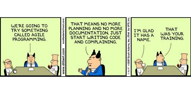
Agile UX
A fellow classmate, Revellie, pinned an article this week about how personas should be used in Agile UX. The article was interesting, but it really caught my interest because of what we are trying to do at my workplace. Agile UX is a hot buzzword in the community these days, centering around the agile methodology that is being used more and more across software development teams. Unfortuntely, UX can be left out of the decision to shift to an agile methodology, leaving the UX team to quickly figure out how to adapt, in what seems to be the most important function of an agile lifecycle. I would have to imagine that these growing pains exist at more places than just mine.
It sounds great to the development team to come to UX and say, "Hey guys, we have good news, we can implement things faster now, we're going agile, so give us what you've got!" And it will work for a sprint or two; until the backlog that was put together in a week with low hanging fruits runs out. Then development asks for more items to put in sprint 2, but UX is still in the process of designing and testing in order to know what should be prioritized in the backlog. So from that point on, UX is trying to play catch up, and either delaying development or sacrificing usability testing.
So what needs to happen to fix this? UX needs to be a part of the decision to move to agile, and agile shouldn't happen until UX is ready. UX needs to be ahead of the game, with personas created, design complete, testing and iteration done, and the backlog full of stories, all before fingers touch keyboards to start writing front-end code. Depending on the project, at least a month is needed for UX and the product team to work after the decision is made to move to an agile appraoch. Then the work can be done in parallel from there. And when I say in parallel, I mean in parallel and in constant collaboration.
And that's the end of my rant!
06.26.16
I knew nothing about typography
Looking at the title of the module for this week, Typography, I was far from excited about the opportunity to learn about different fonts. Sure, I have decided what font to use on projects and there are fonts that look nice to me, and others that I hate. But what more is there to learn?
Well that mindset changed quickly as I dove into the materials for the lesson and learned that I didn't even know what a font was! What I called a font before is really a typeface, and then what I called a font style is really just a font. From that point on I realized that this lesson on typography would be a useful one, and it turned out that I have learned more in this week than any of the previous weeks - things that had never even crossed my mind before but are so essential in design.
From the videos in the course materials to some other items that were posted by classmates on their UX Resource Board, I have truly gained an appreciation for all that goes into the creation of a font, the scrutiny needed to choose a type system, and the emotion that a particular font or typeface can generate. The metaphor of "dressing for the occasion" is perfect.
06.19.16
How does a link open?
In Tracy's Pinterest post this week, she added an article that poses the question, "How should a link open?" In summary, the article's author argues that almost all links should open in the same browser window. He says that this is what most users expect to happen. And also notes that if necessary, the user can choose to open the link in a new browser window manually.
While those arguments are all true, I still question his philosophy. I don't think we can make the generalization that all links besides a few exceptions - the user is filling out a form and needs to click on a link to review, say, terms of service or the user is watching video or listening to audio - should open in the same window, essentially closing your existing window. I think there are more scenarios that would call for a "_blank" attribute, like one I recently had to decide on in my own design. I designed our wedding website to include links to attractions around San Antonio, Texas for out-of-town guests. To me, the links are most likely to be used supplementally, if a user is interested, but they are probably not what that person came to the site for. If clicked, the user will likely want to come back to the wedding site afterwards. In this case, to close and take them totally away from the site to visit these links doesn't seem fair.
Maybe we need a more explicit way to show how the link will open, or a better way for the user to choose how it opens. I can tell you with much certainty, the target audience of my wedding website has no idea that it's possible manually choose how to open a link.
06.11.16
Nobody uses Fast Cash
In Chapter 11 of Johnson's Designing with the Mind in Mind he talks about risk and exploration. When mistakes in a system are easy to make and/or difficult to recover from, people are averse to exploration and learning. Simply put, we aren't willing to take chances in order to learn a better way.
I think that there is something to be added to this concept. The cost of recovery is heightened for certain important things in one's life, one example being their finances. For example, the time spent interacting with an ATM is an anxious one, even when the designers do a great job making the system low-risk. For example, I have noticed through observation that ATM users are unwilling to use a Fast Cash feature, even though in reality it is something that would be easy to undo. But still, system one generates a sense of uncertainty when the user sees the new button even though it explicitily states what its function is. And system two is left out of the decision. The person feels more comfortable taking cash out the way they are used to, by going through a workflow, selecting an account, an amount, and a receipt type, instead of a one-click opportunity to get cash.
It's a functionality that makes for a delightful experience, but one that is useless until we as designers find a way to get past system one to make the user see risk to be so negligible that it is worth the exploration.

06.03.16
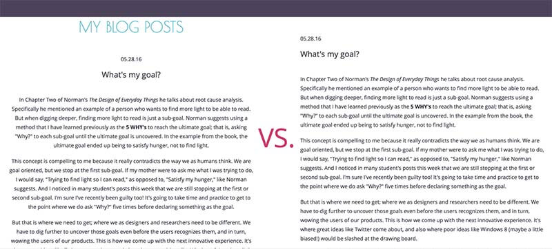
My blog is hard to read!
In Chapter Six of Johnson's Designing with the Mind in Mind he talks about how reading is unnatural and how we as designers need to make reading as simple as possible when it's necessary. To do this, we need to adhere to how the brain is trained and naturally coded to read. And wouldn't you know it, my blog is difficult to read!
I have always liked the symmetry of centered text, but after studying how human eye movement works while reading, the fact that I like it isn't enough to rationalize making the person that's reading deviate from the feature-based automatic eye movement pattern that is natural. The old design of my blog would force the reader to search for the actual beginning of the next line every time he finished reading the line before.
So Professor Polansky and anyone else that has read my blog before, I am sorry! Though I will say I think I'm doing well with the font size, hierarchy, etc.
05.28.16
What's my goal?
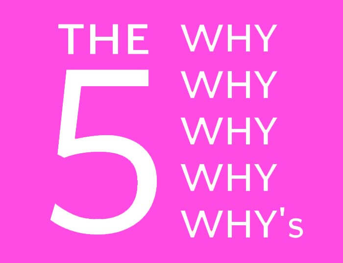
In Chapter Two of Norman's The Design of Everyday Things he talks about root cause analysis. Specifically he mentioned an example of a person who wants to find more light to be able to read. But when digging deeper, finding more light to read is just a sub-goal. Norman suggests using a method that I have learned previously as the 5 WHY's to reach the ultimate goal; that is, asking "Why?" to each sub-goal until the ultimate goal is uncovered. In the example from the book, the ultimate goal ended up being to satisfy hunger, not to find light.
This concept is compelling to me because it really contradicts the way we as humans think. We are goal oriented, but we stop at the first sub-goal. If my mother were to ask me what I was trying to do, I would say, "Trying to find light so I can read," as opposed to, "Satisfy my hunger," like Norman suggests. And I noticed in many student's posts this week that we are still stopping at the first or second sub-goal. I'm sure I've recently been guilty too! It's going to take time and practice to get to the point where we do ask "Why?" five times before declaring something as the goal.
But that is where we need to get; where we as designers and researchers need to be different. We have to dig further to uncover those goals even before the users recognizes them, and in turn, wowing the users of our products. This is how we come up with the next innovative experience. It's where great ideas like Twitter come about, and also where poor ideas like Windows 8 (maybe a little biased!) would be slashed at the drawing board.
05.18.16
Think Younger
In the closing of Tony Faddell's TED Talk, he mentions the three things we should do as designers. He said we should look broader, look closer, and think younger. Think younger is the one that really resonated with me. He gave an example of how his son asked why the mailbox doesn’t tell them when it has mail in it. How great of a question is that?! Sure, the kid might have some good ‘thinking’ genes, but it goes to show how great children’s minds are for solving the problems we have that go unnoticed. Nobody thinks about making a chore like getting the mail easier because we have been doing it the same way for over 100 years.
I think this hits home for me especially because I work at a huge bank. The majority of the things that go on at the bank have been going on for over 100 years, just like retrieving the mail. So most of us that bank here or work here are blind to the problems that exist. And that’s across the financial industry. If one bank could ‘think younger’ and thn find innovative solutions to those problems that nobody even realizes that we have, it would really set itself apart.